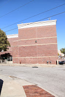
Following test shots on Sunday, our letters were cut out on the CNC, sanded and painted, all on Monday. Mercedes took care of overseeing the letters at the CNC since it happened during Photo and Image class. She and Marie were able to sand and paint them, and then finish the sides with nice tape, Monday evening. We took the shots Monday night, around 10:30, at Larry's apartment.
Tuesday afternoon, we picked the photos to print and settled on how to lay everything out on our wall. While I was at work, Mercedes, Marie, and Larry were able to get the photos printed, everything mounted, and hung on the wall by 6 that night.
If you follow this link to Larry's blog, documentation of our pictures, video, explanation, and hanging of all of the materials are there.
Wednesday, October 30, 2013
Monday, October 28, 2013
typographic interaction, location mock
On Sunday afternoon, the group went to the location we picked, 'crashed' my car and took photos of it.
Friday, October 25, 2013
packaging, photos
These are the picked ideas for the packaging project. Each box is printed on cardstock from Office Depot. I photographed them in the studio downstairs and edited in photoshop.
Altered photo
Illustration
Photographic
Tuesday, October 22, 2013
typographic intervention
Our group - Mercedes, Marie, Larry, and myself - have chosen to use the phrase where r u? to address the issue of texting and driving. If you go to Mercedes' Blog, she has posted photos of the intersection where we want to crash the where r u? phrase. It's at Brookside Blvd and 51st street, near UMKC, a heavily trafficked area by both cars and students.
These are a few photos from the very beginning of the concept phase -
These are a few photos from the very beginning of the concept phase -
My notebook of ideas + the unite notecard sketch
The group discussing things
Marie filling out our concepts chart
Following the presentation of our concepts, we realized that our words were too literal. That feedback has brought us to where we are now, with the phrase where r u? We are going to use the Helvetica Neue typeface since this is the typeface that Apple is using in its new iOS 7 system. The phrase will be made using the CNC and out of 3/4" foam, purchased from the Home Depot.
I went context photographing on my own, over the weekend. These were potential spots that our other idea, 'UNITE', could have been presented. A few of these spots could potentially work for where r u? as well, but again, we decided to go with the Brookside Blvd location.
Monday, October 21, 2013
Sunday, October 20, 2013
packaging, part dos
Just some progress on this package project.
A shot of the package army.
This is the one that was most well received during critique.
I've been working this weekend on some new packages with the input I got from critique. When I feel they're ready, I'll do some work to get them posted.
Wednesday, October 16, 2013
the postcards
The final postcards for myself and Larry.
"People ignore design that ignores people" Frank Chimero
Our two best prints.
All of our experiments.
One of my experiments.
The two experiments done on marbled paper were my cards. I applied the marble paper to a postcard using mod podge. I then covered the paper in gloss finish mod podge because I was interested in how the ink would interact with the finish. It doesn't show up super well when looked straight on, but it becomes visible when you start looking at it from different angles.
Saturday, October 12, 2013
the package project
Package redesign - Crayola Oil Pastels
I took my oil pastels and started recreating the package for it. The initial package is really pretty ugly.
This photo is upside down, but you can still see the ugly. I guess it works on a certain level because it is Crayola and they make products mostly aimed toward young children and I think this screams children - the bold yellow and green shapes that make up the background, the purple color of the typeface, the typeface that oil pastel and 16 are set in. It all feels childish to me, and works in that sense.
But. It still looks ugly. So let's redesign!
These are the ones I've come up with and printed except for the black and white one I created. It didn't print well; I'll put up the document shot of it.
These are some new ones I've made since Friday in class when we critiqued with each other.
Just a couple of tweaks to one of the original ideas. A lot of feedback I got was that the boxes with the actual pastels on them worked stronger. I made that change and then added an idea I had late Thursday night: use actual artwork made by the pastels on the top portion.
Subscribe to:
Comments (Atom)


