Pages

Monday, September 30, 2013

branding

I was tasked with doing this project for Sam.

Some things I got out of her while talking -
She is first born. She likes serifs and more whimsical typefaces, but not slab or fat serifs. Typefaces that are handwriting-esque are something she enjoys. She is self described as quirky and dramatic.

I have a collection of compositions, but here are a few that I am currently enjoying most.


classy, organized, dramatic

Saturday, September 28, 2013

charlie chaplin poster


This is the final image of my poster, that I printed at the print center. I believed that it conveyed a sense of the old silent films that Chaplin was known for, and his Tramp character was featured in.
I don't feel the print conveys this as well. Just my thoughts on it.

Thursday, September 26, 2013

digital postcard

These are the two digital layouts I did for our postcard project. Based off the list posted to the Type 1 blog, I used 48pt Futura, and then 24pt and 14pt Century Gothic in place of the 24pt 20. Century Gothic and 14pt Alternate Gothic that were on the list.
We are going for the sans serif, so I think whatever is down there that looks best is what we will end up using. (almost certainly Futura)


Wednesday, September 25, 2013

frank chimero, designer

"People ignore design that ignores people."

This was said by Frank Chimero. I couldn't find the exact situation and time it was said in, but it was said before April 29, 2009. (That's the first article I found that reference the quote.) In 2010, he was under the age of 30. He currently lives in Brooklyn and works for Studiomates. He has taught design classes at Missouri State University and Portland State, and graduate classes at SVA. I chose his quote because I believe it to be true. I think it's because of what I was taught in high school - it's all about the reader. If you make something for an audience but don't take into account anything that applies to them, what reason do they have to look at it? As a designer, if you're not going to have any regard for the people you make things for, they don't have a reason to pay attention. What you make isn't necessarily for yourself (in a sense); it's about what the people you make for want.

charlie chaplin


Yay for posters. This is the photoshop document version that I printed. the Konica was a nightmare for everyone. You pretty much had to get lucky and you would be able to print. I got lucky.
Tiling was also frustrating, just trying to get things to line up and look good. I learned from Larry that there is a really nice way to tile with rubber cement and choosing to print with crop marks. Knowing that now, I'll print to tile like that every time. It looks significantly better. The more you know!

Monday, September 23, 2013

the constructed image

Here's a picture of what I accomplished over the weekend. This took forever. It's not done, obviously. A lot needs to happen, but it'll happen!


Friday, September 20, 2013

visual order

balance

ambiguous- compositional elements contain a lack of relationship between each other
asymmetric- an irregular composition of elements, centered around a central axis.
symmetric- a set of compositional elements composed symmetrically around a central axis and convey regularity, stableness, etc.
neutral- nonactive composition, that is characterized by randomness.


ambiguous balance


asymmetric balance


 symmetric balance


neutral balance


Wednesday, September 18, 2013

typographic identity, part final

We've reached an end. This is my final design for my typographic identity.


Things it is meant to convey-
tall, thin, simple, reserved, basic

type reading

cause you asked for 'em - notes from the reading

  • type elements seem simple enough, but there is a huge amount of complexity to the way they are arranged; hierarchy
  • If our reader understands, then the typorgrapher has completed their job
    • Is good design done when you have fed everything to your reader? Or are we supposed to have them question things sometimes? There has to be a medium
  • Everything around us create constraints to how we can present type.
    • How do we know the constraints of a particular place?
  • Spoken communication relies on word denotation and connotation
    • denote - literal meaning; connote - additional meanings by evoking associations
  • Text is not reducible to pure denotation
  • Typography and technology are constant companions
    • 50 years ago would they have said this?
  • Separate elements make up a whole - essentially a design is one "thing." there are never smaller elements when the "thing" is finished; their is just one large item.
  • Elements are interpreted in relation to others
  • Figure/ground = figure: positive space; ground: negative space
  • I've always wondered why point size never seems consistent between typefaces.
    • I still don't think I grasp why different typefaces set at the same point size vary in size. Can you elaborate more?


charlie chaplin bio facts

His full name is Charles Spencer Chaplin.
He was born on April 16th, 1889 in London, England.
He and his older brother began careers as actors to fend for themselves after their father's death and mother's illness.

Chaplin came to the United States in 1910 with the Fred Karno Repertoire Company as a vaudevillian comedian.
In 1917, he decided to become an independent producer so that he could have more say in his movies. He started the construction of his own personal studio: Charlie Chaplin Studios in Los Angeles. (Now Jim Henson Studios)

Tillie's Punctured Romance was released in 1914. It was the first feature length comedy.
The Kid was released in 1921.

Chaplin created his iconic character, known as The Tramp for Mabel's Strange Predicament in 1914. However, he was first seen in Kid Auto Races at Venice, which was filmed after Mabel, but released two days before.
The Tramp is associated with silent film. He was last seen in Modern Times, where he was given a voice at the end of the film, in the form of a gibberish song.
Characterized with a bowler hat, mustached, cane, large shoes, baggy pants, bow-tie, tight coat jacket, and thick eye makeup.


and a bonus -
here's his signature


Beautiful handwriting.

Sunday, September 15, 2013

color harmonies + relationship manipulators

The final slides for our Keynote-


So many reshoots. And photo edits. And repositioning. And color finding. The amount of work that goes into a five minute presentation is extraordinary. I've been aware of this fact for awhile, but I thought I'd just blog about it for a second. Also, relationship manipulators are not the easiest to convey with books. I think deep depth of field and perspective were the hardest to get a shot of, because of how similar it looks to a shot set up without one of the relationship manipulators. Juxtaposition also isn't the most obvious, but all three of them are there.

visual order

Just some updates on what's going into the visual order publication-


New figure/ground shot. Not sure if it'll stay yet either, but I like it more than the one I had before.


New similarity shot. I thought that it perhaps showed symmetry better than my initial picture.


And a new proximity shot. Just trying to make things work a little better.

I guess that's all for now. 
Until the next photo update, of course.


Saturday, September 14, 2013

typographic identity, part tres

Typographic identity is hard, yeah?

These two shots are of the two original ideas I took and played with more. 


Here, we find shots of the five different ideas I'm considering as my identity. I haven't made a decision yet. I'm going to sleep on it and decide by Tuesday, when I have to get it printed. So, we'll see.


Friday, September 13, 2013

symmetry

The four symmetry laws we learned, and definitions-

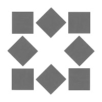
reflection - an image is altered by flipping it 180 degrees over an axis, creating a mirrored effect
rotation - turning an object an equal distance around a fixed point, repeatedly to create a pattern
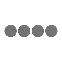
translation - the equal movement of an object, either horizontal or vertical, to create a repeating pattern
glide reflection - a combination of flipping an image 180 degrees over an axis to mirror it, and then translating it horizontally or vertically.
dilation - often paired with glide reflection, it is the slight change in size of a particular image, after it has been reflected and translated.


reflection


rotation


translation


dilation

Some compositions, yeah? I think these compositions don't work as well as the gestalt compositions did. My analog pieces are very precise and so they have a quality that makes them look like they were made entirely in the computer. Some of the symmetry movements are harder to convey with these perfect-esque looking shapes. I haven't scanned them yet, but I have new shapes that were torn, as Tom suggested. I plan on trying them out asap.


reflection


rotation


translation


glide reflection/dilation

The glide reflection compositions were the hardest for me to grasp. I'm still uncertain if I really have, totally. Do they all need to include dilation? I don't know.